 Incented
AI Visual Guidelines
Specifications for generating on-brand Incented visuals with AI image generation tools
This guide provides the specifications needed to generate visuals that align with the Incented brand using AI image generation tools (Midjourney, DALL-E, Stable Diffusion, Gemini, etc.).
For the human-readable brand guide with logos, voice, and naming conventions, see the Branding Guide.
Two Visual Styles
Incented uses two distinct visual styles. Choose based on context.
| Style | Mood | Best For |
|---|---|---|
| Hand-Drawn | Approachable, friendly, human | Diagrams, explanations, blog posts, casual social |
| Clean Line | Professional, trustworthy, warm | Marketing, formal docs, product UI, press materials |
Both styles share the same color palette and brand elements. The difference is in line quality and polish level.
Hand-Drawn Style
Think "smart friend explaining something on a whiteboard."
- Slightly wobbly lines (not perfect vectors)
- Simple shapes with organic imperfections
- Whiteboard/napkin sketch aesthetic
- Hand-drawn borders and connectors
- Imperfect rectangles and organic arrow curves
Clean Line Style
Think "modern SaaS product design" (Notion, Linear, Stripe).
- Smooth curves and precise shapes
- Professional but not cold or corporate
- Human-centered, warm minimalism
- Card-based layouts with clear hierarchy
- Editorial magazine quality
What to Embrace vs. Avoid
Embrace
- Warm, natural color tones
- Human figures and interactions
- Organic shapes alongside geometric ones
- Illustrations that feel handcrafted
- Accessible, friendly imagery
- The carrot motif as a subtle accent
Avoid
These elements pull visuals away from the Incented brand:
- Neon glows and gradients
- Circuit board patterns
- Blockchain/node network visuals
- Futuristic/sci-fi elements
- Dark matrix-style aesthetics
- Glitchy or digital artifacts
- Hexagonal patterns
- "Web3" visual cliches
Incented is a human coordination tool that happens to use blockchain. The visuals should reflect people working together, not technology for its own sake.
Color Specifications
Dark Mode (Default)
Use dark mode for website graphics, social media, and app-related visuals.
Background:       #0A0A0A
Surface/Cards:    #171717
Surface Raised:   #262626
Border:           #292524
Text Primary:     #FAFAF9
Text Secondary:   #A8A29E
Orange Accent:    #F97316
Orange Dark:      #EA580C
Ratios:
- Background: 50-60% of composition
- Surface/Cards: 25-35%
- Orange accents: 5-10% (focal points only)
- Text: remaining balance
Light Mode
Use light mode for documentation, print materials, and presentations.
Background:       #FFFFFF
Surface/Cards:    #FAFAFA
Surface Raised:   #F5F5F4
Border:           #E7E5E3
Text Primary:     #0A0A0A
Text Secondary:   #78716C
Orange Accent:    #F97316
Same ratios apply. Orange is premium; reserve it for CTAs, key data, and brand moments.
Semantic Colors
Use these consistently for status indicators:
Success:    #22C55E    (approved, completed, positive)
Warning:    #F59E0B    (pending, attention needed)
Error:      #DC2626    (failed, rejected, destructive)
Info:       #3B82F6    (informational, neutral highlight)
Color Rules
- Orange is premium. Reserve for CTAs, key data, brand moments.
- Cards create hierarchy. Use surface colors to layer information.
- Contrast for accessibility. 4.5:1 minimum for text.
- Consistent borders. Stone gray borders unify the design.
- Whitespace is intentional. Generous padding creates a premium feel.
Typography in Generated Images
When generating images that contain text, use clean sans-serif fonts.
| Level | Size Range | Weight | Usage |
|---|---|---|---|
| Display | 48-72px | Bold, -1.4px tracking | Hero headlines, page titles |
| H1 | 36-48px | Semibold, -0.02em | Section headers |
| H2 | 24-30px | Semibold | Card titles, feature names |
| H3 | 18-20px | Medium | Subsections, labels |
| Body | 16px | Regular, 1.5 line-height | Descriptions, content |
| Caption | 14px | Medium | Metadata, timestamps |
Recommended fonts: Inter, SF Pro, Helvetica Neue, or any clean geometric sans-serif.
For data and numbers: Use tabular figures and monospace alignment.
Visual Elements
Cards
Cards are the primary container in Incented's design language.
- Border: 1px solid, using the border color for the current mode
- Border radius: 12-16px
- Padding: 24px
- Subtle shadow in dark mode, soft elevation in light mode
Buttons
| Type | Background | Text | Radius |
|---|---|---|---|
| Primary | #F97316 | White | 8px |
| Secondary | #292524 (dark) / #F5F5F4 (light) | Foreground | 8px |
| Ghost | Transparent | Orange | 8px |
Icons
- Style: Lucide-compatible line icons
- Stroke: 2px consistent weight
- Size: 16px (small), 20px (default), 24px (large)
- Color: inherit from text, or orange for emphasis
Composition Patterns
Technical Diagrams
- Use card containers for nodes
- Orange borders or fills for active/highlighted nodes
- Directional arrows with rounded caps
- Labels centered or below nodes
- Clear flow direction (left-to-right or top-to-bottom)
Marketing Graphics
- Asymmetric layouts welcome
- Clear hierarchy: Icon/Image, Headline, Body, CTA
- Brand orange as accent, not overwhelming
- Hero image or icon as focal point
Product Illustrations
- Show actual UI patterns from the app
- Card-based layouts reflecting real product
- Orange highlights on interactive elements
- Clean, minimal annotation
Mascot Guidelines
Incented's mascots are rockabilly rabbits: anthropomorphic bunnies in 1950s rock 'n' roll fashion.
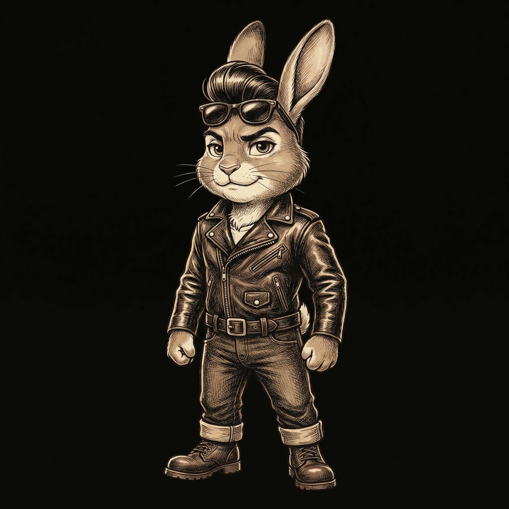
Reference: Rockabilly
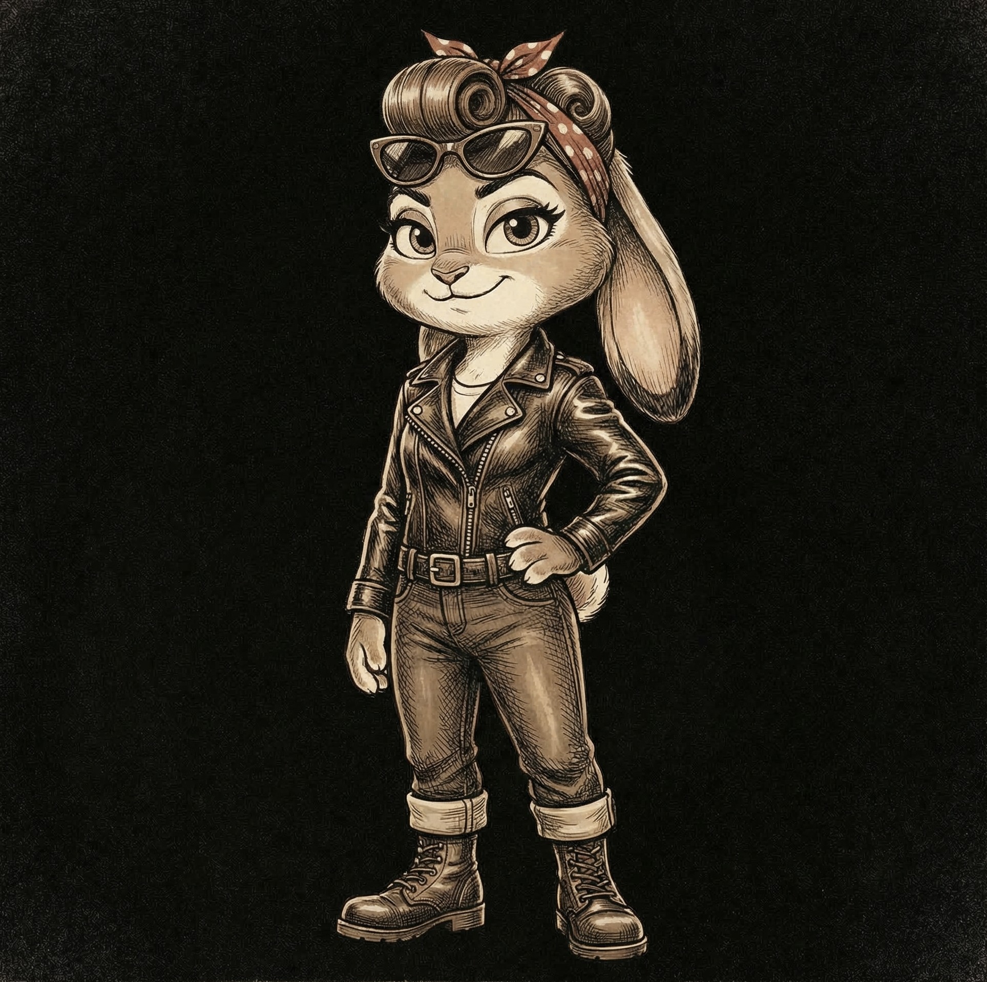
Reference: Rockabella
Character Specifications
Essential traits:
- Anthropomorphic rabbits with human-like posture
- 1950s rockabilly fashion (leather jackets, pompadours, victory rolls, sunglasses)
- Cool and capable but not aggressive
- Natural gender balance (rockabillies and rockabellas)
Fashion elements to include:
| Element | Options |
|---|---|
| Jacket | Black or brown leather, classic biker style |
| Hair | Pompadour, slicked-back (male); victory rolls, pin-up curls, ponytail with bandana (female) |
| Eyewear | Wayfarers, cat-eye sunglasses, round shades |
| Shirts | White t-shirts, plaid/checkered shirts, cropped tops |
| Pants | Rolled jeans, khakis, high-waisted skirts, capri pants |
| Accessories | Patches on jackets, wristbands, hoop earrings, bandanas |
Mascot Color Palette
Mascot illustrations use a warm vintage palette (distinct from the UI palette):
Beige Background:   #F5F0E6
Warm Cream:          #EDE5D8
Sepia Brown:         #8B7355    (line work, shading)
Dark Brown:          #4A3C2A    (deep shadows, jackets)
Void Black:          #121212    (contrast background scenes)
Illustration Styles
| Style | Technique | Best For |
|---|---|---|
| Detailed Sepia | Rich warm tones, crosshatching, vintage feel | Hero images, feature illustrations |
| Grayscale | Black/white/gray, clean linework, graphic feel | Documentation, technical contexts |
| Silhouette | Solid black on transparent/colored background | Icons, loading states, badges |
Scene Concepts
| Concept | Scene | Rabbit Action |
|---|---|---|
| Contributing | Rabbit at laptop | Focused, typing, headphones |
| Validating | Group around table with papers | Discussion, pointing at documents |
| Building | Multiple rabbits with tools | Construction, blueprints |
| Admin | Rabbit in server room | Standing confidently |
| Empty State | Rabbit in void | Confused, scratching head |
| Error | Rabbit frustrated | Arms crossed, facepalm |
| Success | Rabbit celebrating | Arms up, jumping |
| Loading | Rabbit waiting | Tapping foot, checking watch |
What Not to Do with Mascots
- Don't make them cartoonish or childish
- Don't use bright/neon colors (stay warm and vintage)
- Don't mix modern fashion with the 1950s aesthetic
- Don't make them aggressive or threatening
- Don't use photorealistic rendering (keep illustrative)
- Don't forget the signature elements (jacket, hair, shades)
Aspect Ratios
Reference for generating images at the correct dimensions:
| Use Case | Ratio | Resolution |
|---|---|---|
| Twitter/X Card | 2:1 | 1200 x 600 |
| Twitter/X Post | 16:9 | 1200 x 675 |
| 1.91:1 | 1200 x 627 | |
| TikTok | 9:16 | 1080 x 1920 |
| Farcaster | 3:2 | 1200 x 800 |
| BlueSky | 3:2 | 1200 x 800 |
| Blog Header | 16:9 | 1920 x 1080 |
| OG Image | 1.91:1 | 1200 x 630 |
| Documentation | 16:9 | 1920 x 1080 |
Emotional Registers
Match the visual tone to the content:
| Register | When to Use | Visual Treatment |
|---|---|---|
| Professional | B2B content, enterprise | Clean, structured, minimal orange |
| Energetic | Launches, announcements | More orange, dynamic composition |
| Trust | Security, governance | Balanced, centered layout |
| Growth | Metrics, success stories | Upward trends, green accents |
| Community | Contributors, DAOs | Warmer tones, connected elements |
| Technical | Architecture, APIs | Precise lines, monospace fonts |
Validation Checklist
Before using any generated visual for Incented:
Must Have
- Correct background for mode (dark:
#0A0A0A, light:#FFFFFF) - Orange (
#F97316) used sparingly as accent (5-10% of composition) - Card-based hierarchy where appropriate
- Proper contrast for accessibility (4.5:1 minimum)
- Professional, warm appearance
- Human-centered feel (not crypto/tech-forward)
Must Not Have
- Overwhelming use of orange
- Neon glows, gradients, or circuit board patterns
- Generic "AI art" style with smooth plastic rendering
- Blockchain network visualizations or hexagonal patterns
- Cluttered composition
- Incorrect brand colors
- Aggressive, dark, or dystopian mood